
HAPPN - CROSSING PATHS, DIFFERENTLY
How to maximise the experience of our promise: "Find the people you cross paths with"?
"Finding the people you cross paths with", but what does that really mean?
Happn's promise is simple: connect people who have crossed paths in real life. But in practice, "crossing paths" is more complex than it sounds. We were tasked with maximising that core experience and the first thing research taught us was that we didn't fully understand it yet.
Understand before designing
Working with two other product designers, we ran user interviews with one clear focus: understand how people actually experience geolocation in a dating context, and what 'crossing paths' really means to them
UX Research
Deep-dived into user behavior to surface the real pain points in dating app map
Ideation
Find suitable solutions to meet users' needs regarding the use of geolocation
User tests
Validated with real users to learn which approach resonated
Iteration
Take user feedback into account and adapt the user journey so that it best meets users' expectations
The insights were sometimes contradictory
0%
Users worry about sharing their location, but accept it in certain contexts.
"A bit of fear. I don't want anyone to know where I live, where I work."
0%
The concept of crossing paths sparks curiosity, but not all crossings feel meaningful.
"I live near a busy street, I pass by 200 people without leaving my home... that doesn't really highlight the idea of crossing paths."
0%
For female users specifically, sharing geolocation felt ambivalent and paradoxical, curious enough to engage, cautious enough to hold back.
"Deciding when to share information about the places I frequently visit."
These tensions reshaped our problem entirely. We stopped asking "how do we show more crossings?" and started asking: how do we give users control over which crossings actually matter?
A new problem statement
How can we enhance the concept of crossing paths by giving users more control over their geolocation to encourage interactions?
After defining our new problem, we generated several creative ideas using ideation tools and workshops such as Mindmaps and Crazy 8. After identifying several directions, we prioritised our actions according to technical feasibility and time.
The main idea that emerged was to act on the map only, and in this way help users to control the areas that interest them and those that don't, for reasons of security or to filter their shared locations.
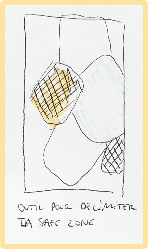
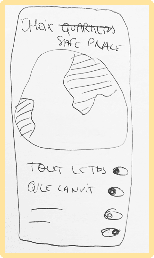
Secret Zone
We observed during our research phases that users did not want to be seen or crossed in certain places, such as their home or workplace. We developed a feature based on the map that allows users to draw an area where they do not wish to be seen by others; this area is called the: "Secret Zone."
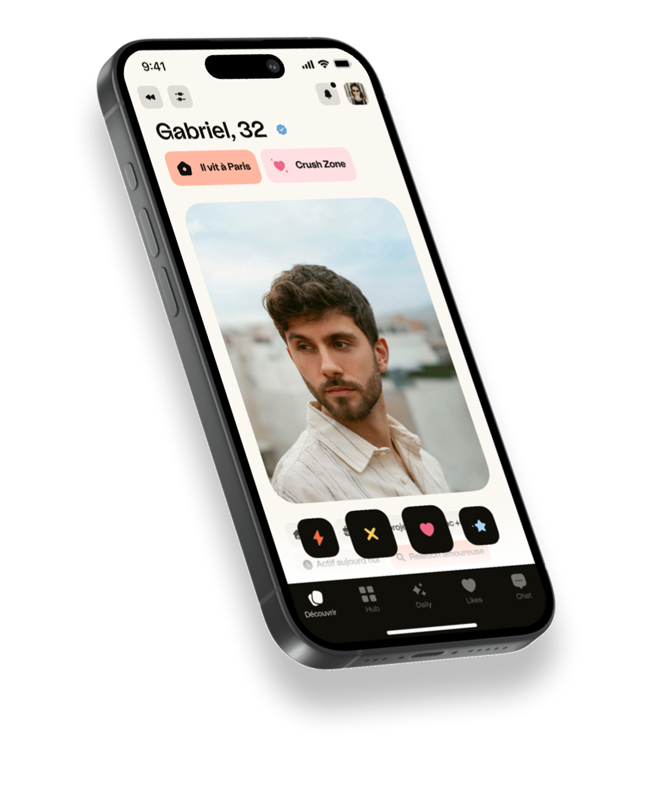
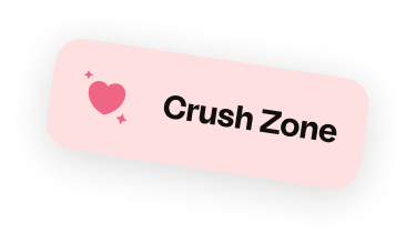
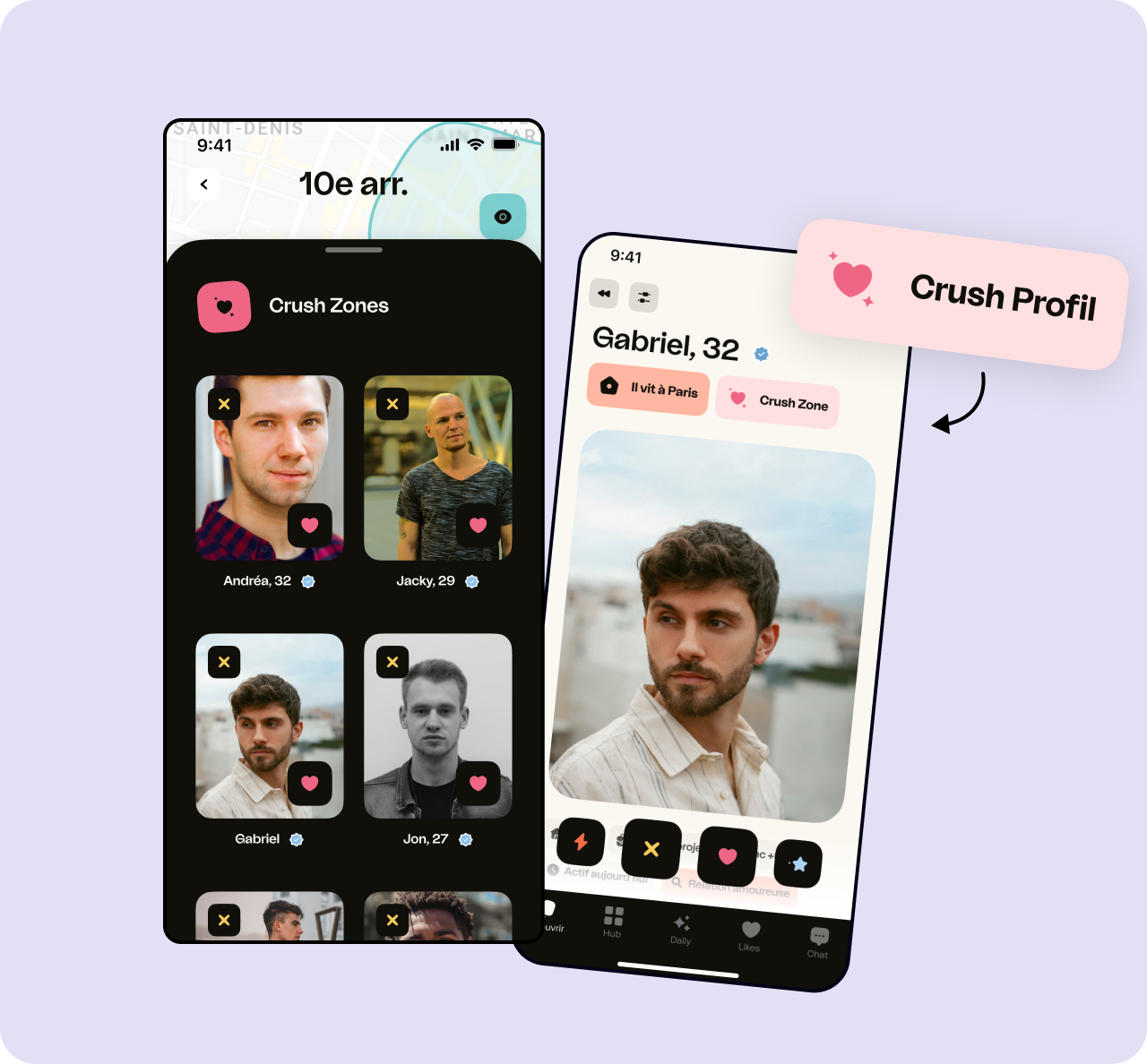
The Crush Zone
Conversely, we found that users associated a common place or neighborhood with a mutual area of interest. We therefore decided to highlight these areas by allowing users to draw on the map the zone where they are most interested in connecting with others: the "Crush Zone."
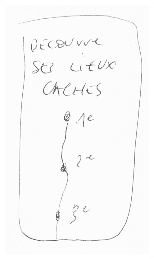
Crush profiles
Thanks to the previous Crush Zone, we created a selection of profiles associated with these areas that may show more interest to the user. Profiles can be accessed directly by clicking on the zone or found in the profile with a tag to highlight them.
User testing challenged us immediately
0%
The Crush Zone was confused with Spots, existing saved locations.
"Isn't it related to the places you save as favorites?"
0%
Users wanted to see profiles in the Secret Zone even while remaining hidden.
"There I can see the profiles, but they can't see me"
0%
The size and number of zones created new anxieties.
"I would want to create a large Crush Zone to have a better chance of meeting someone."
The feedback pointed to one clear truth: we were solving the problem from the wrong angle.
The pivot
Instead of asking users to define where they want to cross paths, we flipped it: define where you don't. By hiding the areas where you don't want to be seen, every other crossing becomes more intentional and more valuable. One zone. One simple gesture. A fundamentally different relationship with location sharing. The feature that emerged, drawing your own Secret Zone directly on the map, tested immediately well. 'Drawing by hand is innovative. It's intriguing.' Sometimes the simplest interactions carry the most meaning.

This design sprint was both challenging and rewarding.
The best moment of this project wasn't the final presentation to Happn's team, it was the pivot. Seeing our initial assumptions fail in user testing, then finding a simpler and more honest solution on the other side, reminded me why testing exists. The best ideas don't always survive first contact with users.
The pivot was my favourite moment of this project but there's much more to share! Let's grab a coffee and I'll walk you through it.
Next Case Study
Samsung
How does data become design decisions that actually move conversion?
Samsung
How does data become design decisions that actually move conversion?